A R T I S T S T A T E M E N T
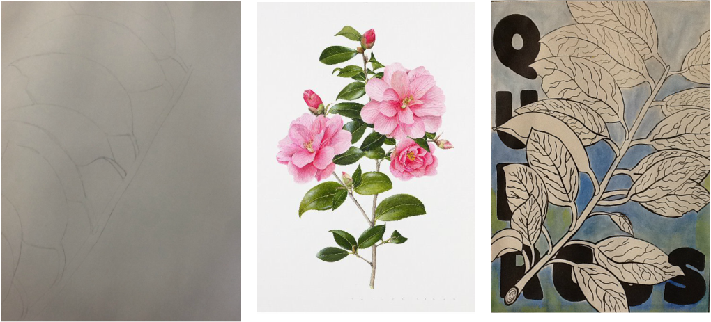
Creating my magnified nature piece was possibly my favorite so far, but I use the word loosely. It was still a tedious hassle. As always, I had to utilize mixed media, but fewer than usual. I incorporated permanent markers of different sizes to create varied line weights, cutout shapes that made my life a lot easier when it came to using words as a design element, and water colors to add in the background. I studied both botanical art images and scientific illustrations to help me create my piece. My background consisted of the scientific name of my plant and the cool colors blue and green, which originally came from the color yellow, which of course was still seen vaguely. The colors I added gave my picture more variety and depth, it made it look better, while balancing the rest of the piece out. To create the plant itself, I used varied line weights and a few contour lines to give a 2D image more dimension and texture, which together created a rhythm throughout the entire page that was unified with a pattern of lines that were thicker if closer to you, and thinner if further away.
The reason I created this piece was mainly based off of six thumbnails I created in class. I felt like over all, it came out the best and would be a simple subject that I could add lots of detail to and make it look great. I chose to have my image more magnified so that I could pay attention to the fine details within the veins of the leaves. I wanted the composition of my piece to fill practically the entire page, and I was successful in doing so. I feel like by doing so, my over all piece came out much better based on the fact that I utilized all available space. I chose to simply title this one after its scientific name, "Quercus", primarily because the letters in the background are swallowed by the plant itself.
The reason I created this piece was mainly based off of six thumbnails I created in class. I felt like over all, it came out the best and would be a simple subject that I could add lots of detail to and make it look great. I chose to have my image more magnified so that I could pay attention to the fine details within the veins of the leaves. I wanted the composition of my piece to fill practically the entire page, and I was successful in doing so. I feel like by doing so, my over all piece came out much better based on the fact that I utilized all available space. I chose to simply title this one after its scientific name, "Quercus", primarily because the letters in the background are swallowed by the plant itself.